Community Events: Claw Together, Claw Web & Workshop X3
- Objective
- Build a visual system consistent enough to connect three very different event formats, while adapting the communication to different audiences, from the OpenClaw community and first-time users to shop owners and sales teams looking for practical ways to put AI into their workflow.
- Role
- Art Direction, Event & Campaign Design
- Responsibilities
- Key visuals & social campaigns · LED screens, backdrops & standees · Stickers & community awards · Tickets & merchandise · Workshop landing page · Hands-on design and execution
- Team
- In-house, working closely with Growth, Product and Engineering
OpenClaw VN grew largely through Facebook and Zalo. When the community began moving offline, the challenge was no longer simply to make each event look good. It was to build a visual language clear enough for people to recognize the same community whether they encountered it through a meetup, a webinar or a sales workshop. Each format had a very different job. Claw Together was about bringing the community together. Claw Web made OpenClaw easier to approach for newcomers. Workshop X3 moved directly into real sales and customer-support problems. The system therefore could not be so rigid that every event looked identical, but it also could not start from zero each time.
Claw Together #1 · 06.06.2026 · Ho Chi Minh City
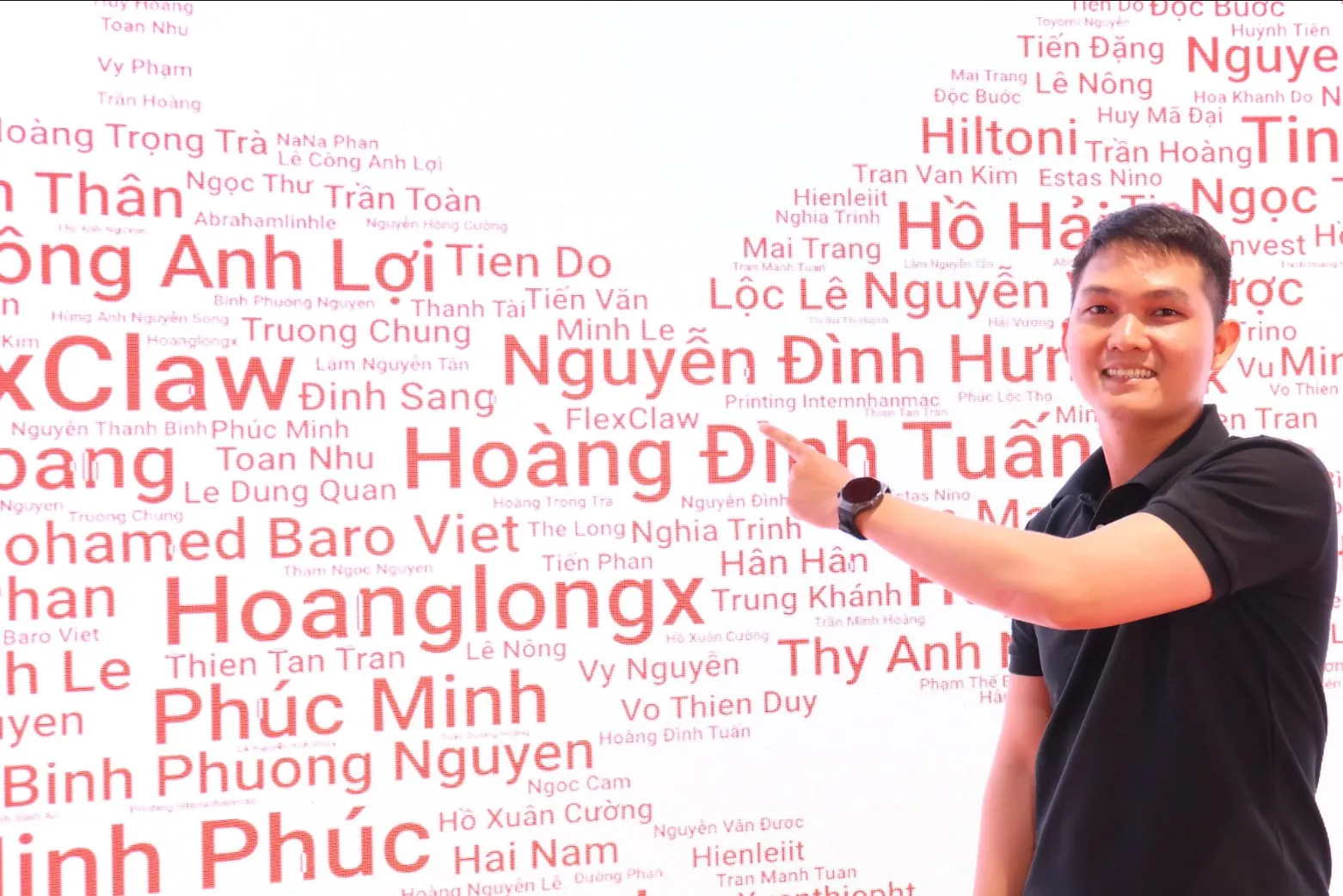
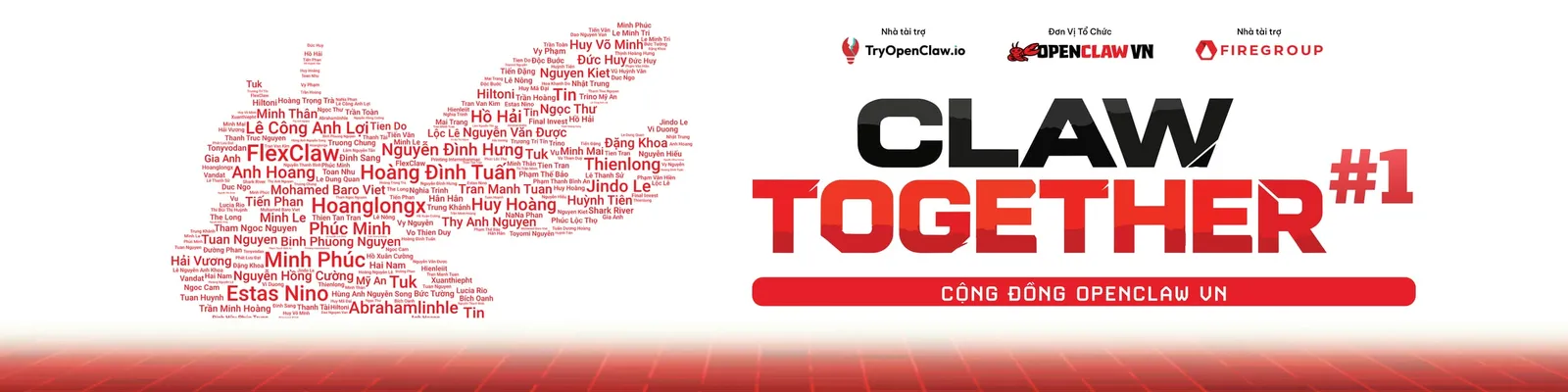
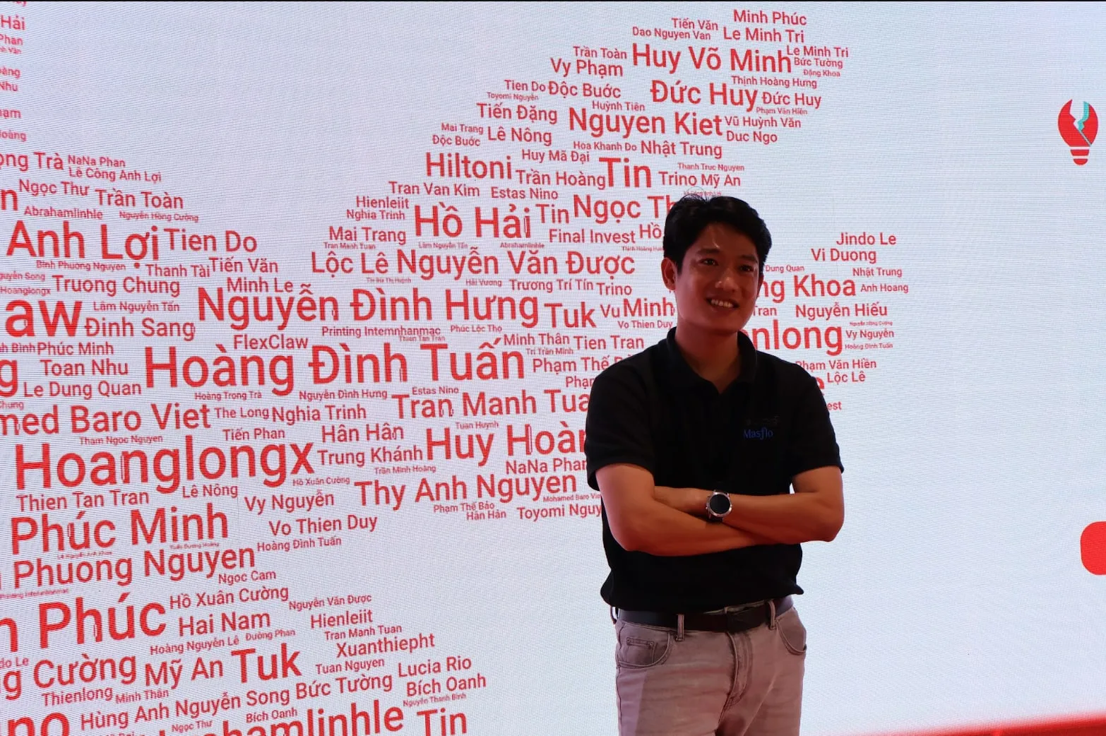
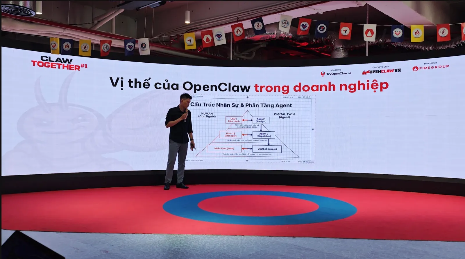
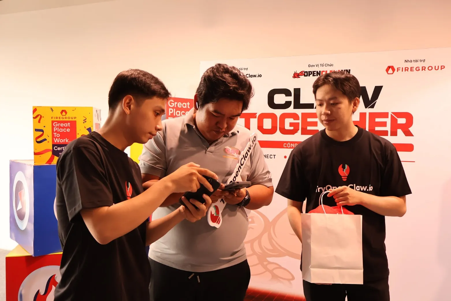
Claw Together #1 was the first offline meetup of the OpenClaw VN community in Ho Chi Minh City, with around 70 attendees. Instead of filling the main LED screen with a large logo or headline, I built the lobster mascot from the names of everyone who registered. The idea was simple: if this was a community event, the community itself should become part of the image.
People arrived, searched for their names on the screen and naturally began taking photos. The key visual became both a check-in moment and a way for each attendee to literally see themselves inside the community.
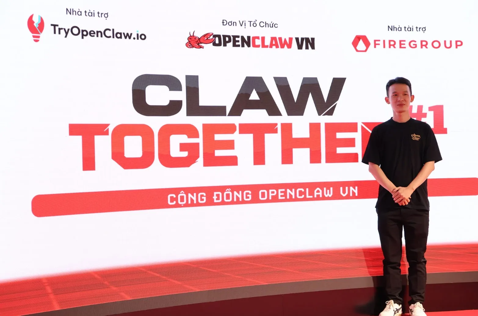
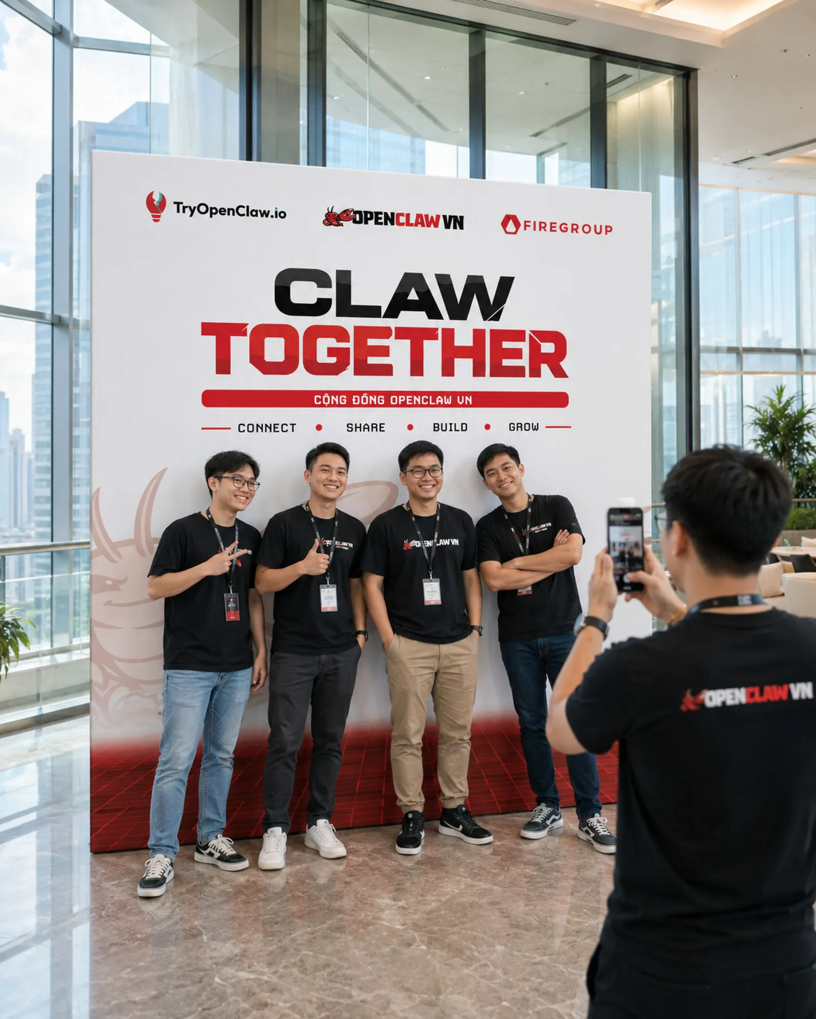
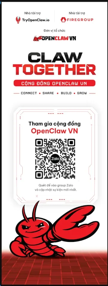
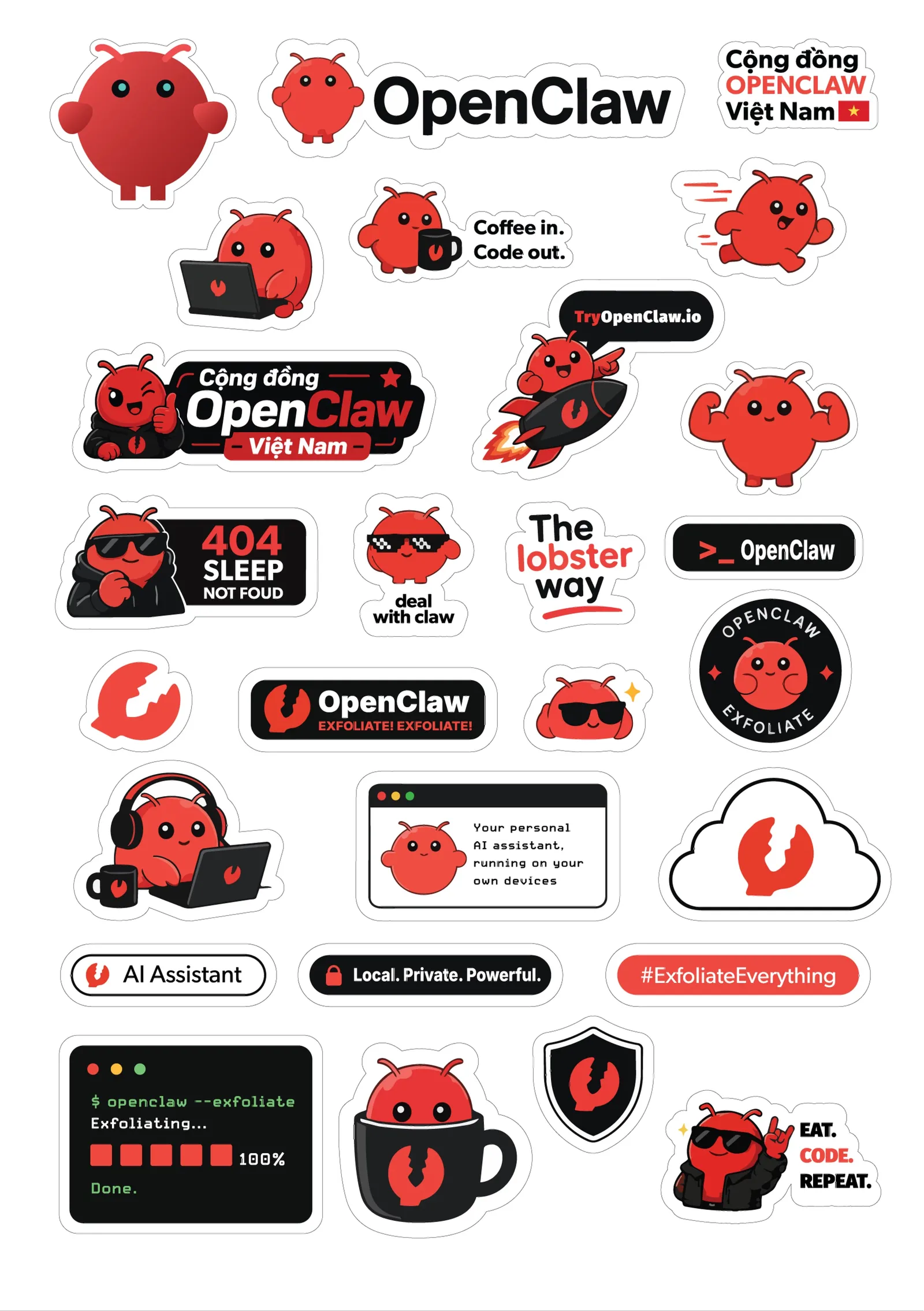
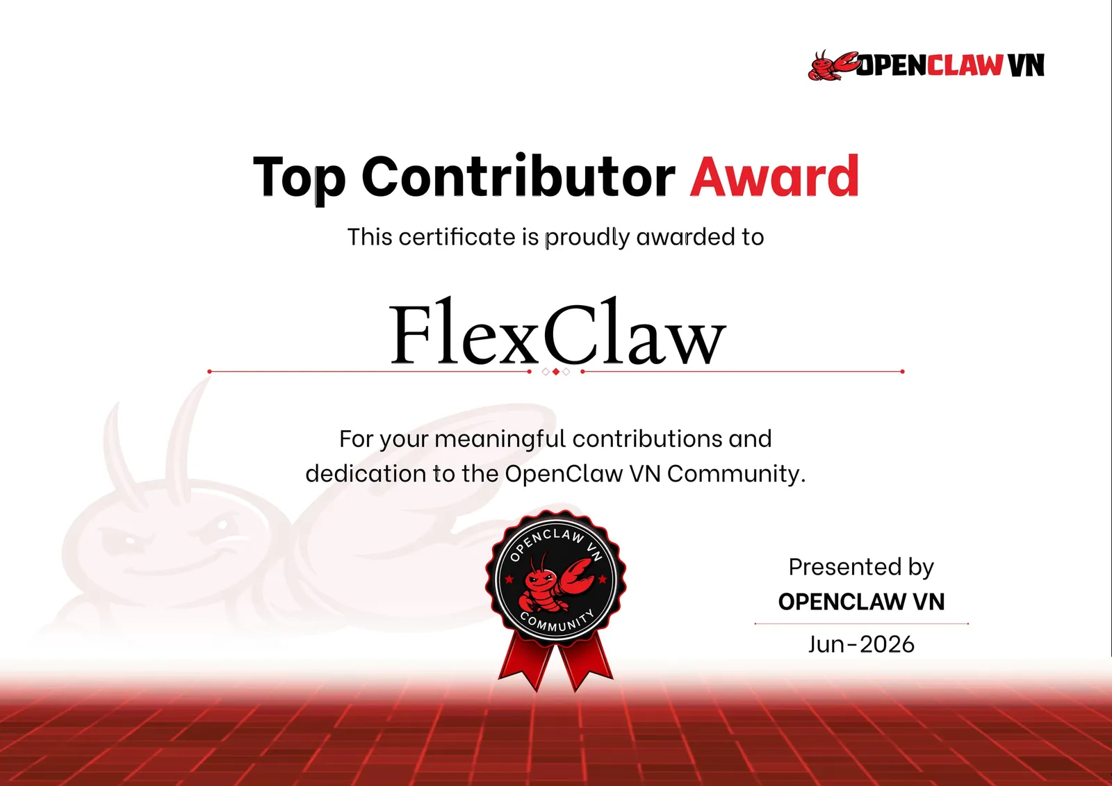
The same language extended into the photo backdrop, a standee leading people into the Zalo group, mascot stickers and a Top Contributor award for members who had contributed most to the community. Here, the visual system was doing more than identifying an event. It gave a community that had mostly existed online a physical presence.
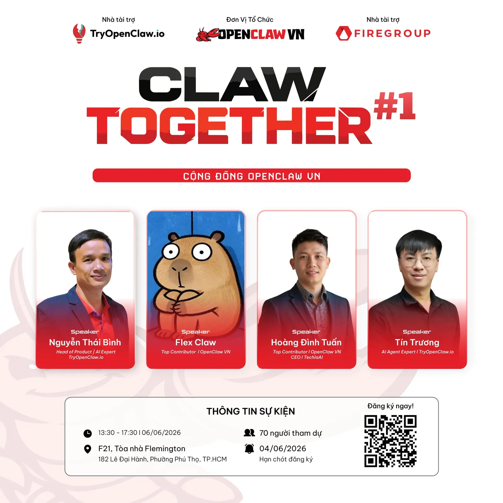
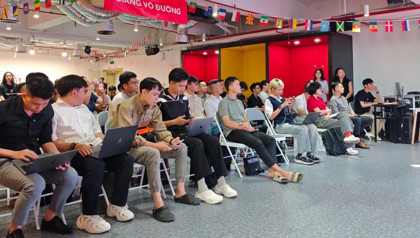
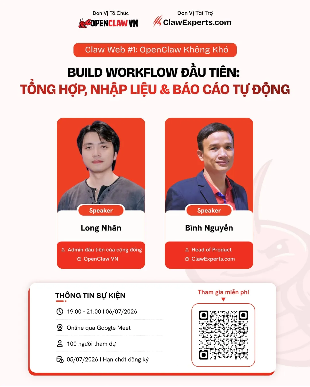
Claw Web #1 · 06.07.2026 · Online
The “OpenClaw Isn’t Hard” webinar had a different problem to solve. There was no stage or physical check-in experience. Most people would encounter the event through a feed or a small screen, with only a few seconds to understand the topic, speakers and registration details. I kept the palette, mascot and recognizable structure from Claw Together, but reduced the visual weight and gave information hierarchy a much larger role. The same identity became lighter, clearer and more instructional.
Workshop X3 · 12.09.2026 · Ho Chi Minh City
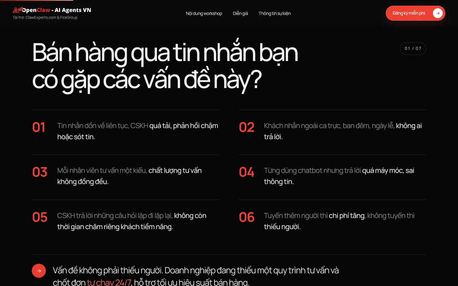
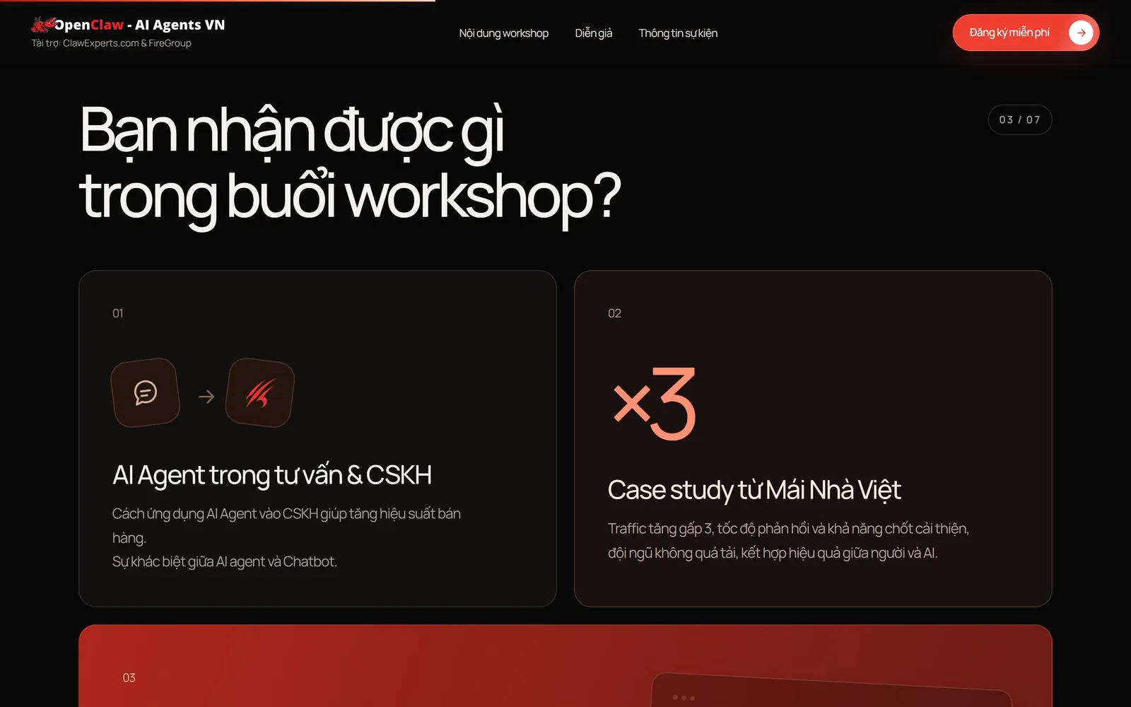
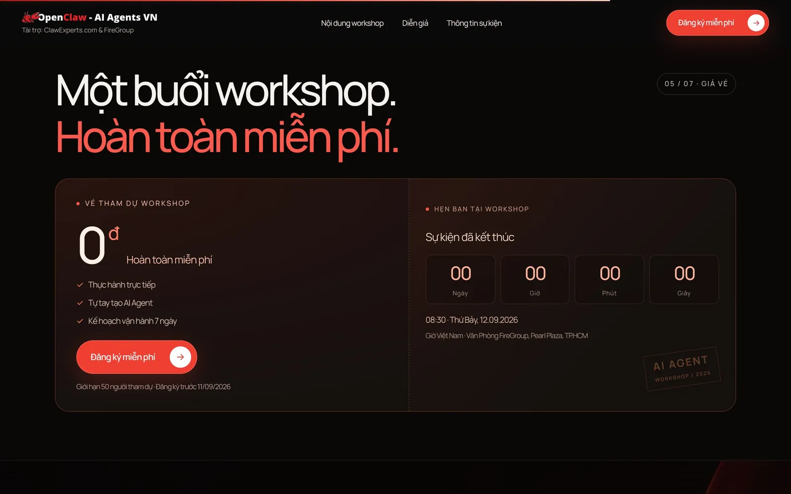
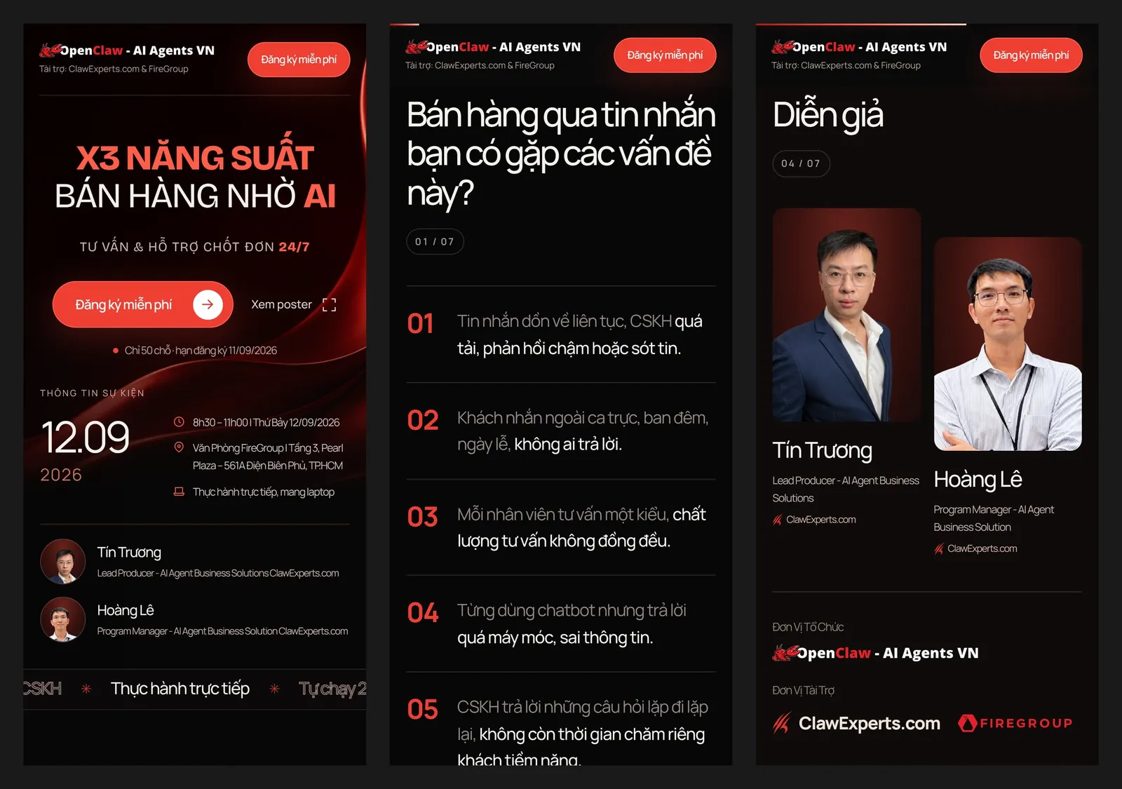
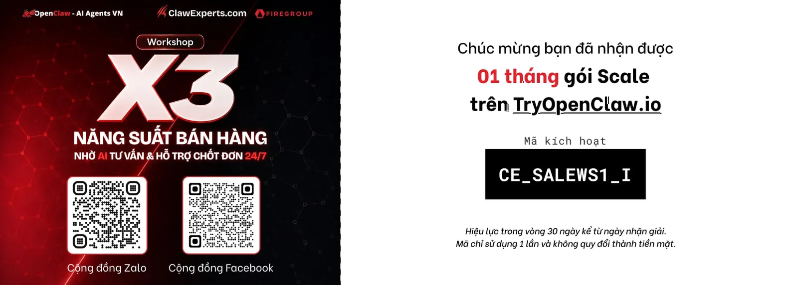
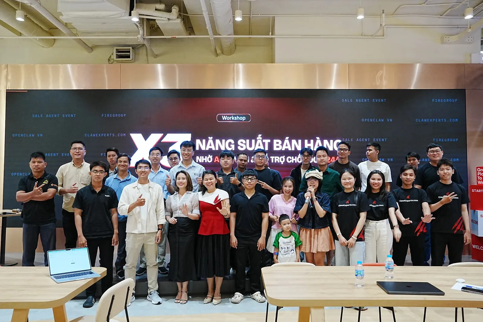
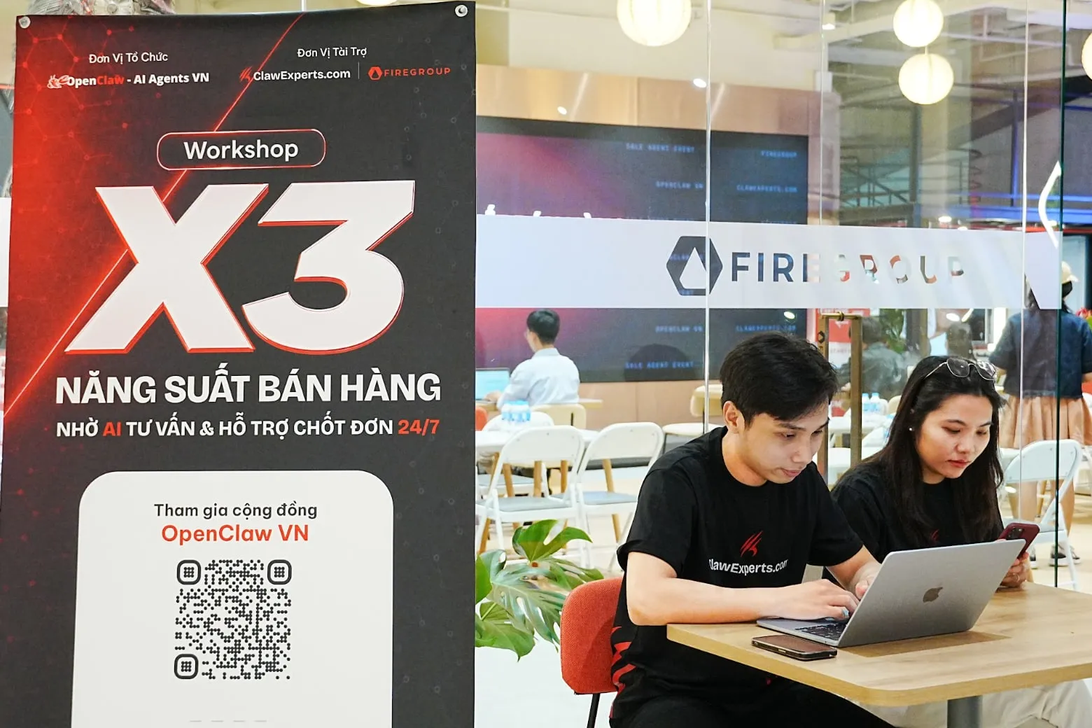
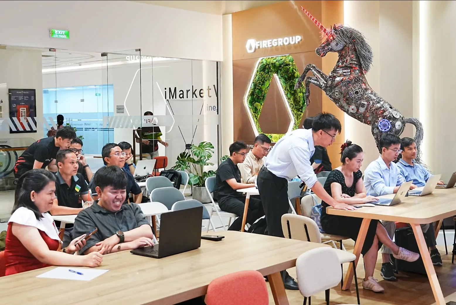
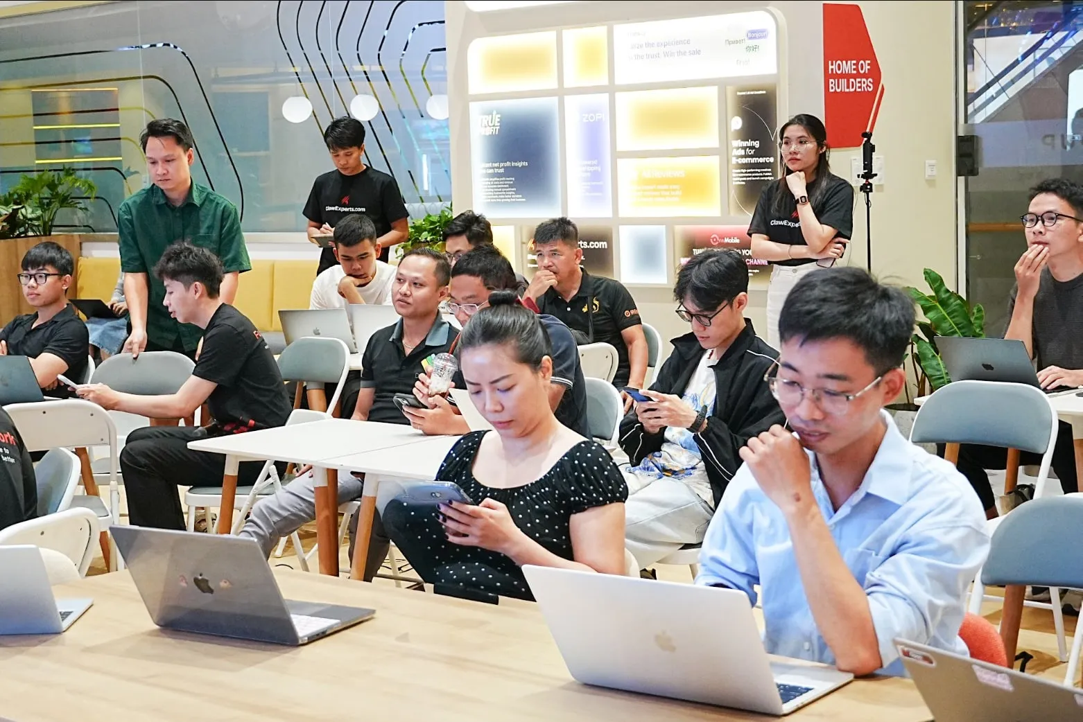
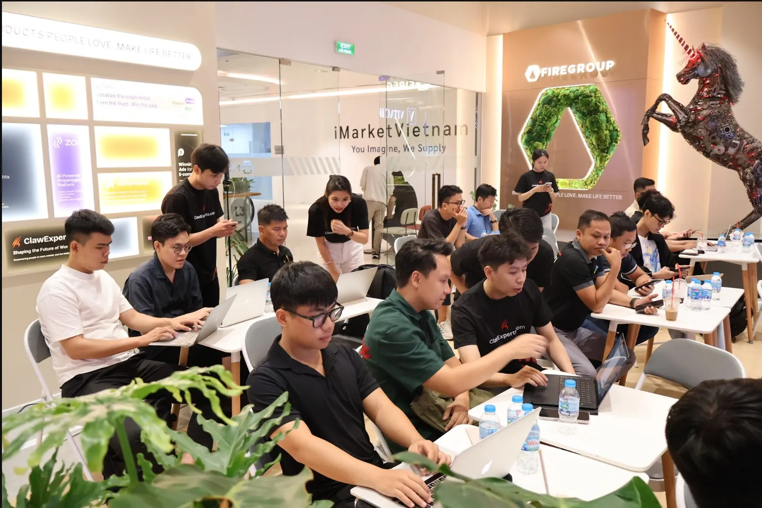
By Workshop X3, the audience had changed almost completely. This was no longer primarily an event for people already interested in OpenClaw. It was a hands-on session for shop owners, sales teams and customer-support teams dealing with a concrete operational problem: responding faster, qualifying leads more effectively and avoiding missed conversations when the team could not stay online continuously. The visual direction therefore moved away from community-first communication and became much more outcome-led. A black ground, large typography and the X3 figure became the focal point. Instead of beginning with the technology or the mascot, the communication began with the result the audience cared about.
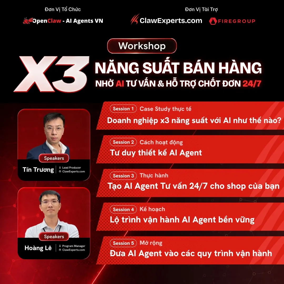
The system extended from social posts to the standee, venue LED screen, invitation ticket with a Scale plan activation code, and the registration landing page. I designed the page in Figma and then built it myself in HTML/CSS, keeping the same hierarchy from the first ad impression through to registration.
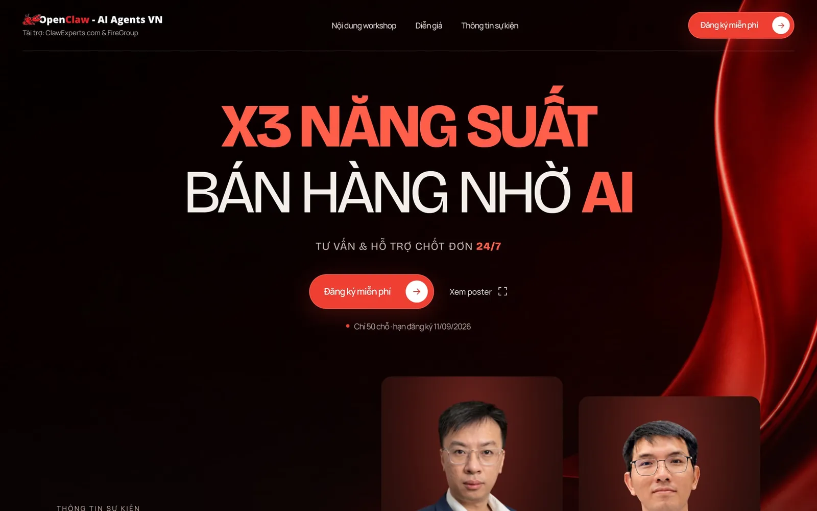
One system, three voices
The three events did not need to look the same. What needed to remain consistent was the logic behind them. The same red-and-black palette. The same mascot. The same approach to logo placement and information structure. But the hierarchy, tone and visual emphasis changed depending on who was looking at it. Claw Together put people at the center. Claw Web put clarity at the center. Workshop X3 put business outcomes at the center. That is the part of event branding I find most useful: not forcing every touchpoint into the same layout, but defining just enough rules for the work to stay recognizable while allowing each format to speak to its own audience.
Event pages · Workshop X3 on Luma · Claw Web #1 on Luma