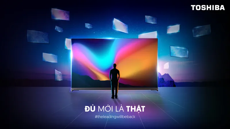
Why the Word “Real”?
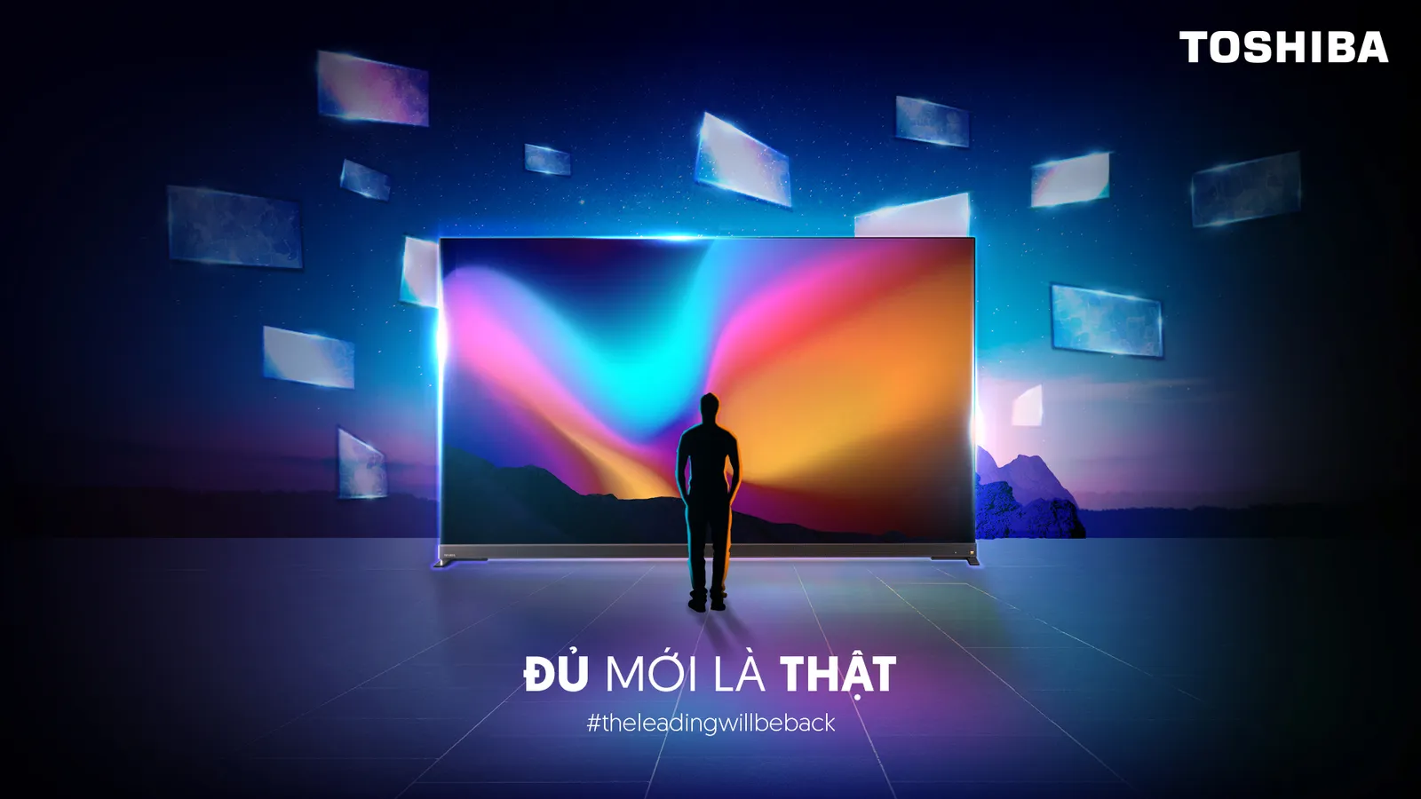
In 2022, Toshiba TV was preparing to return to the Vietnamese market after a long absence. Looking around the category at the time, the advertising language was familiar: brighter colors, sharper images, newer technology, and feature lists that kept getting longer. The IMC pitch team chose to go the other way. Instead of talking about “more”, the idea focused on what people actually feel from a TV: real color, real image, real value. From there, “Real” became the territory of the campaign. The hard part began once the territory was settled. “Real” is an easy word to say and a hard one to see. Placed on a key visual on its own, it would read much like dozens of other promises about picture quality. The question I set for the visuals was: how do you make people feel “real” before they read the word “real”? The answer became a single visual principle: what happens on screen is so true to life that it crosses the TV frame and keeps existing in the real space around it. In football season, the match walks into the living room. For sound, the world inside the screen spills outward. In other campaigns the storytelling could change, but the line between screen and real life was always the thing being played with. Looking back, what stays with me most is not any single key visual. It is the realization that a good big idea still needs a visual principle clear enough to carry it forward. Once the principle is right, the campaign can change with each product, season and message without rebuilding the visual world from scratch every time.